Trawling The The Thrift Stores with Joseph Finn
Happy Thursday, everyone! The sun is shining, it's going to be a balmy 40 degrees and yesterday the US had a government change that just made everyone feel just a tiny bit better. So I thought, based on a random find yesterday, that we might try something just a little bit different this week. As you know, I have a love for Criterion Collection releases. I think overall they do an excellent job of presentation and preservation and they also look damn nice on a shelf. Why don't we take a look at some of the evolution of that presentation over the years?
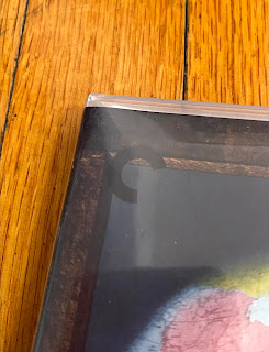
Here we have the 1988 release of Seven Samurai on laserdisc, which I ran across yesterday. No, I don't even have a laserdisc player on which to play this. So is it an object that is purely for display and enjoying the phyisical presence? Sure. But oh my, Criterion at this point is already showing some solid design choices. This is a pretty simply cover, but it's well laid out. The minor problems are that huge THE CRITERION COLLECTION banner on the top and the small logo on the bottom, which detract a bit from the simple look of this cover. Let's take a look at that logo.
The one piece of insert inside the box, a letter explaining things that we're all familiar with now, like alternate tracks and making sure your TV's color settings are at least halfway correct (for a long time, Criterion DVDs included a color bars feature you could turn on to see if your TV was set up correctly). Interesting to see here that Criterion at this point was headquartered in California; they're now in New York City along with their parent company Janus Films.
In case you haven't seen a laserdisc in a while, here you go. For the younger readers, they're the size of a vinyl LP, but at essentially a huge DVD (but feel much more substantial). In this case, Seven Samurai is on both side of four laserdiscs, which good lord that's a lot of flipping.
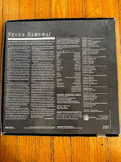
Finally, the back of the box. More about how you can pause, fast-forward and slow motion and a list of completely useless chapter headings. Note the Janus logo in the lower right.
____________________
So let's fast forward to 1998! The Most Dangerous Game was one of the first titles that Criterion released on DVD that had not had a previous laserdisc release. A lot of their previous design touches were there, but there have been some changes for the modern era (1998 was the first year they started producing DVDs).
Note the Criterion banner is still there, but it feels less intrusive now. The cover is just sleeker and less cluttered, even if I'm not a fan of the weird photo filter used here. We can see how their house design is evolving.
A fairly standard DVD look here (the actual case feels completely of the time; it's slightly flimsy but has held up pretty well). There's that Criterion banner again on the bottom of the DVD.
A pretty standard Criterion booklet for the time with a shortish essay (for them; I have Criterions with booklets where the essay can go on for 15 pages). The colors and look are coordinated with the rest of the DVD and though I'm not a huge fan on the color choices, it's coordinated.
Finally, the back cover. Again, it's all of a piece and works. Now back to the time machine, Sherman.
____________________
Welcome to 2017 and the modern era of Criterion Collection releases! Here we have Woman of the Year, the first of the Katherine Hepburn and Spencer Tracy collaborations. The DVD case is much sturdier, has a little more weight to it and wow, the design on this is just aces. I particularly like how it looks a bit like a Punch & Judy show. And hey, let's focus on that logo!
There we go, the modern Criterion Collection C logo. It's simple, elegant and just plain works. Designed by a company named Pentagram, it's a major upgrade for Criterion and has quite rightly become a great representation for them.
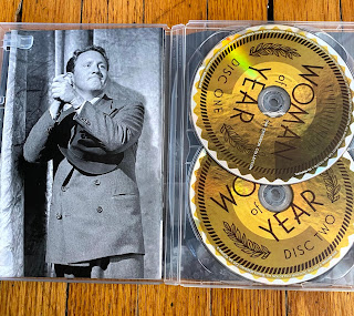
Now, I'm not a huge fan of stacked discs in multi-disc collections but hell, you have to do it somehow. But I love the look of this, with those DVDs made to look like medals. Again, you can see how Criterion is now using this interesting clear plastic for the cases that is much sturdier than your standard DVD case (this extends to their blu-rays; I'm not a fan of most blu-ray cases, which feel flimsy and cheap and Criterions never feel like that).
Look at how many special features they cram on this thing, including two feature-length documentaries, one on George Stevens and one on Spencer Tracy by Katherine Hepburn. And the design is lovely here, everything nicely balanced and in sync (and I'm a huge fan of the color choices). Note that the Janus logo doesn't appear anymore, due to various business reorganizations (they're still a parent company but Criterion is an independent entity). So we get what is now the standard Criterion logo and mission statement in the lower right, along with the various company logos in the very bottom that you see on any DVD, but here it's presented tastefully and in a very pleasing gray.
____________________
So there we have it, the history of Criterion Collection design. Maybe they'll rebrand in another decade and maybe it will be a stop back (hopefully not). But, at least, we can be sure they're never go back to this logo, which makes me cringe every time I see it on an older release.


Comments
Post a Comment